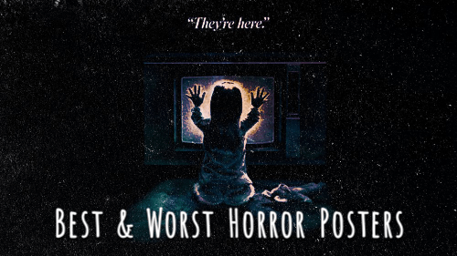
We’re gonna discuss something that I am a BIG fan of and that is horror movie posters. When I was younger, I had TONS of them on my wall, some were horror and some were not like Bring it On, but there’s something inherently cool about movie posters.
And when I was in my college days, I studied visual culture and learned how to utilize InDesign, Photoshop and Illustrator, typography, all sorts of arts and I came up with this idea while looking at TWO different vhs cover art for Phantasm. One, is most likely the original poster art which was most likely hand drawn/painted and the other was a cut out, cropped version of The Tall Man and the title at the top as a MGM feature. Obviously, one speaks volumes than the other and that got me thinking, what would I consider to be some of the best horror movie posters and which are the ones that drop the ball.
There’s a pattern to what I have an aesthetic for and what I truly like and don’t like and we’ll see my examples of that. I won’t go through EVERY movie, there’s about 16 total in both categories so… 32 altogether?
Let’s start with the BEST.
Here we have some of the best in my opinion which to me are very streamlined, clean, simple, minimal (as in not overly busy) and either color influenced or centered.


Bad Moon (1996), Poltergeist (1982), Night of the Demons (1987), The Shining (1980), The Evil Dead (1981), The Howling (1981), The Descent (2005), Dead Alive aka Braindead (1992), The Silence of the Lambs (1991), Tourist Trap (1979), Scanners (1981), The Wicker Man (1973), Maniac (1980), Black Sunday (1960), Alice Sweet Alice aka Holy Terror aka Communion (1976), and Universal Monsters (1920s+) are what I initially thought of as in… the posters tell me as an audience memer JUST enough information visually without giving too much away of what the entire movie will be like from start to finish.
The Shining is bright yellow, which if you don’t know, is one of the most popular colors in marketing/advertising/branding and combining it with black to balance it out, most of us associate black and yellow with WARNING or alert. Anyway, back to the Shining, the color is all about welcoming, warmth, happiness and yet the movie is the complete opposite. To me this seems to be on purpose and I prefer this poster over the one that is of Jack Nicholson’s face during the “I’m here” line.
Also, look at The Wicker Man, Black Sunday and even Dracula, those bright warm colors on the posters really do evoke a feeling. And the juxtaposition or foreboding of what’s to come in the film, genius.
Another aspect is simplicity and center focus. Poltergeist, The Evil Dead, Alice Sweet Alice or The Silence of the Lambs are my examples. These might seem simple and minimal but they aren’t boring, there is a story being told visually. Well, I mean they all are but when you don’t have a lot of chaos or a “predictive silhouette” in future posters, i.e., every big blockbuster movie lately, just pull it back. We don’t need the kitchen sink, simple = better. Also, shoutout to Alien (1979) for fitting in this category but is an honorable mention!
Now, let’s get to the ones I just find boring or too busy or a lot of wtf who signed off on that poster art. And the funniest part of all: a lot of them are remakes.


The Beast Must Die (1974), Scream (1996), Bride of Chucky (1998), I Know What You Did Last Summer (1997), Creepshow 2 (1987), Hellraiser (1987), House of the Dead (2003), One Missed Call (2008), Old (2021), Cabin Fever (2016), Ghost Ship (2002), Black Christmas (2006), Fright Night (2011), A Nightmare on Elm Street (2010), Prom Night (2008), Carrie, (2013) are the chosen 16 to discuss. You might notice that a lot of them are remakes and the reason why I chose them is when you compare the original artworks to a remake, there’s a world of difference.
Is it too much photoshopping? Laziness? There’s something about them that lacks interest or just a feeling of caring. Maybe living in a time of just pure oversaturation and everything looking the same, feeling the same, and perhaps being a remake, there’s not a lot of room for reinvention but they lack creativity.
The Beast Must Die has a weird texture of the werewolf that’s very distracting in a bad way; Scream, Bride of Chucky and I Know are just the actors or characters posing in a greyscale silhouette, that was very popular back in the day and Hellraiser and Creepshow 2 are not bad but they could be so much better. Hellraiser is one hell of a movie and for as graphic and in your face the movie and its topics are, I’m shocked at how… meh this poster is. Yes, Pinhead or Lead Cenobite at this point, is focal and not in the shadows but there’s something off about it. Why not use the box?
Old, by the way, the concept is interesting but the execution looks fake. Like the skeletal foot looks so fake in a day in a time when video games look realistic. Was it a budget thing?
In conclusion, I have a certain taste I was not aware of until sitting down and doing this post. I want to see poster art pushed to the edge, be creative and memorable, be as visual as your movie is. I don’t appreciate laziness, especially when we have computers and technology and the apps to go along with it, when back in time, these were done by hand.
What movies would you add in the discussion? Leave a comment below!
