
Title: Creepshpw
Year: 1982
Director: George A Romero
Writer(s): Stephen King (screenplay)
Producer(s): Richard P. Rubenstein
Costume(s): Barbara Anderson
Cinematography: Michael Gornick
Starring: Hal Holbrook, Adrienne Barbeau, Fritz Weaver, Leslie Nielsen, Carrie Nye, E.G. Marshall, Viveca Lindfors, Ed Harris, Ted Danson, and Stephen King. (the entire cast is even longer)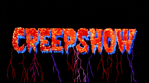


Oh goodness, I thought I did this for Creepshow? Apparently I did not! Creepshow is one (one of two) of the earliest posts I’ve done on this blog in 2019 and I never did a color theory for this film. Wow. I’ve done a “review” of sorts but lately, I did a breakdown of each segment by how long each was and if you’re interested in seeing which is the shortest segment and which is the longest, you can click here for that.
There are so many cool things about Creepshow, visually. It is inspired by EC Comics and the comic book style and that is consistent throughout the film. It’s not as hardcore in the sequel but they keep up with some animation. But the original 1982 film starts off with some great animation of The Creeper, the upcoming stories are highlighted in animated opening credits.
Shout out to the music by the way.
Each segment’s title card is animated in the style of a comic book: the templates, advertisements, before going into live action. Romero wants to take us on a journey into the world of comic books.There are some great uses of color. I mean, the background colors used are mostly purple, red, some blue or green, which are effective with whatever emotion we’re dealt with. Like with Father’s Day or The Crate, there’s passion, anger, tension and you’re using the color red which represents these things. But you look at Something to Tide You Over or The Lonesome Death and there’s a lot of green and blues which feels otherworldly.
There’s also some usage of the color white. Immediately, purity comes to mind and ironically, it’s used in the last segment “They’re Creeping Up on You!”, where our antagonist is trying to rid his home of bugs aka cockroaches and the repercussions of these actions. BUT the color also represents cleanliness which is what he does constantly. It’s about order, disinfecting, and it’s empty. Everything he touches or the environment he lives in is essentially cold. There’s no warmth, no “lived in” space. He’s an angry, entitled, white businessman who looks down on ANYONE else, especially those of color. And using the color white, double entendre, is perfect.
This film is an ode to comic books of the 50s and 60s, especially towards a lot of the people working on the film like Romero, Savini or King; these are most likely what they were interested in when they were younger. This is very much unlike the comic books on screen that we are getting now thanks to Marvel, DC, Amazon with The Boys and we’re literally taking characters from the pages and putting them on screen but Creepshow (as well as Creepshow 2 and a bit of the series) gives us a comic book experience with the pages and frames and colors and effects.
Please check out Creepshow as well as the sequel, which I enjoy. There are less segments in the sequel but the stories are entertaining. There is also the Shudder series which is also fun!
