
Ah, Goosebumps, we meet again!
I have a huge soft spot for this book series and even the television series. I read these books when I was much younger, I am currently trying to add more of the original books into my collection and it’s very hard to and I have been watching some past Goosebumps episodes (Retro Rundown) and reviewing them here. So I wanted to look at the series/franchise again but instead, we’re gonna use my many art degrees for this one. I wanted to highlight and give big kudos to the illustrator Tim Jacobus and his work for the original Goosebumps covers and pick some of my favorites
So today we’re gonna look at my top 10 favorite (best) covers in my opinion and then next time… maybe we’ll do my least favorite cos I do some opinions. But we do have set perimeters. 1) we’re doing original covers so no looks at any of the newer covers that just feel so… blah. 2) I am sticking to the original releases so 1992-1997 and 3) this is for fun and completely separate from the tv series IF the book has become an episode.
Let’s do it!


In order of release number:
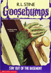
02. Stay Out of the Basement
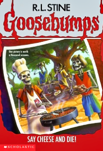
04. Say Cheese and Die
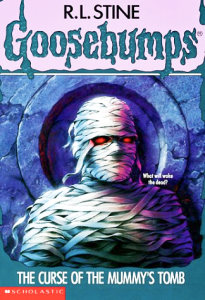
05. The Curse of the Mummy’s Tomb
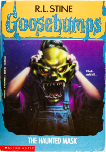
11. The Haunted Mask
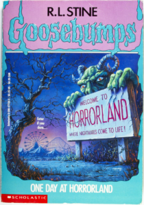
16. One Day at Horrorland
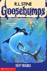
19. Deep Trouble
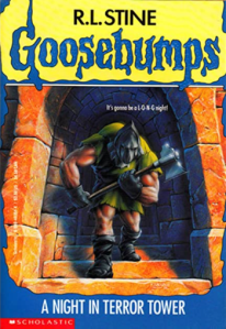
27. A Night in Terror Tower
34. Revenge of the Lawn Gnomes
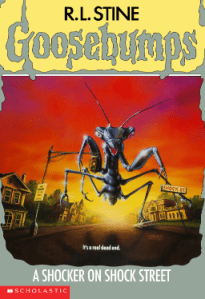
35. A Shocker on Shock Street
50. Calling All Creeps
One thing I enjoy about these covers is a mixture of whimsy and bizarre but not to the extreme where it can disinterest you. I think Jacobus’ work is a great balance of eye catching, just a hint of what the story is about and colorful. I appreciate the bold colors. And I think that’s what sets them apart from other books of that time period. A second one I can think of is also from Scholastic: Animorphs. The bright colors, the morphing on the cover, it gives the same kind of energy. And as a kid back in the day, going to KMart or book fairs in elementary school/middle school, I would be immediately drawn to it.
I think overall, no matter what cover it is, it’s memorable. You might not have read the book but the cover, you cannot forget it at all.
There’s two I want to highlight: One Day at Horrorland and A Shocker on Shock Street for one big reason: color. The colors used for Horrorland is very unexpected and you’d think it would be darker shades but it’s light pinks and baby blues. The highlight for A Shocker on Shock Street is that beautiful gradient of the sun setting. Those rich colors of red, orange and yellow, it looks real. And one that still confused me and kind of creeped me out (still) is Deep Trouble. I’m sorry but I don’t trust water and the lakes/oceans, I’m like that is the world of large creatures. That’s their territory but it’s a mix of a hammerhead and the colors of an Orca, two of my favorite sea creatures, how is that possible??! I know there’s a Deep Trouble II (book and cover) and it’s um, it’s different. It looks like an angler fish met those piranhas from Piranha (1978).
That was a deep cut.
What are some of your favorite covers of Goosebumps? You can pick from original, reprints, Tales, Goosebumps 2000 series, and there’s probably more that I can’t think of. One thing I will like to add in is that on youtube, there’s a channel called Brad’s Brick Post and he recreates covers with legos and it’s very impressive! I just want to share and highlight a very unique channel doing something creative with Goosebumps!
