The intentions of this blog in 2015 was showcasing cinematography and the artistry behind and within horror films. Inspired by a random tumblr that focused on cinematography in dramas, I got the idea to do the same for horror. Thankfully in modern times, horror is taken more seriously, more recognition and acceptance but I still personally think that the genre is considered underrated when it comes to cinematography.
This blog has evolved to include reviews, suggestions, favorites, lists, and color theories. Speaking of, I should do more of those by the way. But today, I wanted to share some of my favorite films that aesthetically, look amazing whether it is camera frame/angle, use of color and lighting or shadows, the overall vibe and art of filmmaking.
Here are some films that you may or may not agree with when it comes to cinematography. But for me and my fine arts/film fan eye, these are some of my favorites.

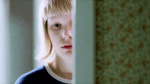
Suspiria (2018), dir. Luca Guadagnino – Personally, I like this remake a lot. Visually, it’s different from its original and it gets a lot of praise from me because of that. The environment and characters come off more realistic and terrifying as well. Big color to watch out for is red.
cinematographer Sayombhu Mukdeeprom


The Cell (2000), dir. Tarsem Singh – It’s an aesthetically looking film, a huge part of that is the costume design from Eiko Ishioka and its visuals. How the film looks when the protagonists are venturing inside of the serial killer, it HAS to differentiate itself from reality. And you do that with visual effects, costumes, and bright, lush colors.
cinematographer Phil Laufer


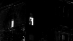
Let the Right One In (2008), dir. Tomas Alfredson – Cool tones, as in warm/cool, not just “cool”. The movie never feels warm or enticing or welcoming and I think the color palette is on purpose.
cinematographer Hoyte van Hoytema


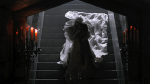
Bram Stoker’s Dracula (1992), dir. Francis Ford Coppola – He, Coppola himself, mentioned at one point that the costumes were the sets. The costumes were designed by Eiko Ishioka and they are beautiful. What helps this film are the sets, it’s set in this fantastical setting with the costumes and special effects bringing it to 100.
cinematographer Michael Ballhaus


Hereditary (2018), dir. Ari Aster – This movie is beautiful. Stunningly beautiful with lush colors. As the movie gets more and more intense, I think the colors and vibrancy are brought out more.
cinematographer Pawel Pogorzelski


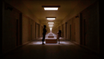
It Follows (2014), dir. David Robert Mitchell – The far away shots is what gets me in this movie. The framing of our lead or a focal point is most of the time centered and we see what’s around her. Jay in front of her home, the beach kill with the young woman’s leg in Tetris mode, the pool scene, it’s all basically centered around a focal point.
cinematographer Mike Gioulakis


Creepshow (1983), dir. George A. Romero – It’s shot and framed like a comic book which makes it unique. The transitions, background colors of purples, blues, reds, finalize the comic book anthology setting. The camera work and framework is unconventional as well, it’s reminding us that THIS is a comic book movie.
cinematographer Michael Gornick


Blood and Black Lace (1964), dir. Mario Bava – There’s something about Italian horror films. If you’ve seen them, you know, but they take slasher films into this beautiful, fantasy level of it feeling like a dream. If I could pick any film from this list for best use of color, it would be this film. There’s nothing dull about this film, cinematography, storytelling, it’s stunning.
cinematographer Mario Bava and Ubaldo Terzano


The Mimic (2017), dir. Huh Jung – I like this film a lot, I watched it after Tigers Are Not Afraid (both films have tigers as a central part), and there’s something about Korean horror, especially more modern/current ones. They look and feel sophisticated, polished but purposeful. It’s beautifully shot, odd angles
cinematographer Kim II-Yeun


Blood Machines (2019), dir. Seth Ickerman, Raphael Hernandez and Savitri Joly-Gonfard – It’s bright colors, electronic music, a full sensory experience. It’s shot and feels like a long music video but very sci-fi and once you’ve accepted that it is more sci-fi than horror and has touches of Metropolis thrown in, you’ll enjoy the experience more.
cinematographer Philip Lozano


The Love Witch (2016), dir. Anna Biller – Is it the color palette? Or how the movie is shot? Or that overall, the movie gives off an older vibe than what it is? It is on purpose I know that much. The staging, inserting of colors and overshots and back shots to bring us into this almost 60s vibe.
cinematographer M. David Mullen


A Nightmare on Elm Street (1983), dir. Wes Craven – The film does what it should; it captures us into a world we don’t know if it’s reality or the dreamworld. There aren’t crazy color combinations or out of the ordinary lighting but the special effects are practical and still hold up today. There’s a reason why Craven is considered one of the horror greats, his talent and creativity to immerse us into this world where dreams and the real world collide.
cinematographer Jacques Haitkin


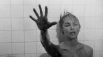
Psycho (1960), dir. Alfred Hitchcock – What hasn’t been said about Psycho? Again, framing, there are these overhead shots and high angles and tricky camera work paints Psycho as this ever looming danger and tension.
cinematographer John L. Russell

Suspiria (1977), dir. Dario Argento – The original Suspiria is I believe the very first Italian horror film I’ve ever seen. And what I saw, I wasn’t expecting. The pacing, the colors are in your face, neon bright. I believe it’s also filmed on technicolor and it has a Snow White kind of energy which is visible throughout the movie. Side note, the end credits is probably one of my favorites, just for the sheer idea of hearing the wails of the witches burning and we just don’t cut from it.
cinematographer Luciano Tovoli


Sleepy Hollow (1999), dir. Tim Burton – Burton’s films tend to have similar color palettes. However, I feel like Sleepy Hollow is possibly one of the “cooler” toned films I’ve seen. It’s cold, out of our comfort level but it’s home-y. The color palette is very neutral based, even the dresses that are “colorful”, still fit into this palette of not sticking out like a sore thumb. The red (for blood) is the most in your face color against a very dreary, cold, secluded setting and Burton, along with Lubezki, do a great job of immersing us into Sleepy Hollow.
cinematographer Emmanuel Lubezki


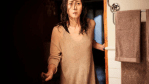
Us (2019), dir. Jordan Peele – Now seeing that the same cinematographer also did It Follows, I can see a similarity. But where It Follows lacked a powerful color palette, Us takes those same frameworks of creating a full narrative of how important a color palette is, how camera angles and movement are essential in telling the story of the tethered.
cinematographer Mike Gioulakis (he also did It Follows)

Other Films to Consider
Get Out (2018)
Halloween (1978, 2018)
It (2017)
The Texas Chainsaw Massacre (1974)
Candyman (1992)
Duel (1971)
The Evil Dead (1981)
Evil Dead 2: Dead by Dawn (1987)
The Haunting (1963)
Carnival of Souls (1962)
Wes Craven’s New Nightmare (1994)
John Carpenter’s Christine (1983)
The Descent (2005)
28 Days Later (2002)
This post was very ambitious and longer than I expected it to be. However, cinematography and the art of filmmaking in general was the foundation of my blog originally on tumblr. If I had done this post years ago, I don’t think half of these films would have been mentioned. What film(s) would you say have memorable cinematography? In horror specifically but mention non horror ones, too.
