Oh Ti West… I love your work and yet, I get disappointed at one of them and it’s devastating! At least according to my ratings on Letterboxd.
From the title, you can kind of guess what kind of post this will be about but not. I enjoyed the X Trilogy overall but I definitely felt there was something missing with MaxXxine. Thoroughly enjoyed X and then fell in love with Pearl, expectations were definitely high with the final installment. As much as I liked it, I was still kind of meh about it and it is the last one ranked on my list of the three films but this isn’t about criticizing the film(s).
This will be more focused on the cinematography of the films and also a consistent color story, a blink and you’ll miss it jab.
Let’s talk about the X Trilogy.

 What was that Super Bowl that Rihanna did at the halftime show? That’s when I was watching X for the first time. Okay so February 2023, I saw X (2022) for the first time and I loved it. It is a slasher reminiscent of Texas Chainsaw, Bay of Blood, The Burning, or other exploitative films. And there’s obvious hints of pornographic film inspirations like Debbie does Dallas or Deep Throat, these films that are rustic and grungy, a bit gritty but fits that time period of the 70s.
 The overall film comes off as de-saturated. Visually, I mean. I was thinking of the romper that Brittany Snow (Booby-Lynn) wears in the film in that peachy-red color and then compare how vivid Pearl’s red dress is in the next film. Same color family but one is very in your face. There’s amazing lighting, especially with older Pearl being shrouded in red light, plays with shadows, really cool cinematography, the look of being outside and the lushness and realism of nature also can be applied here.


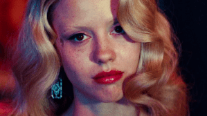
Maxine’s blue eyeshadow is so eye-catching and a standout in the film, especially when she’s in the water and it’s reminiscent of the painting Ophelia by John Everett Millais. It’s a great juxtaposition to the above shot of her swimming when we see she’s being followed by an alligator. It’s small details or scenes like that that makes X really special when it knows what it’s doing and what film it is. It has an identity.


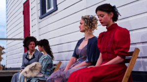
 Pearl (2023), Pearl, Pearl, there are so many things I could say about this one. I adore this prequel so much. I think that out of the 3, this one has the strongest color story. Everything just seems so vibrant and colorful and perhaps that is on purpose for being a prequel. The colors are so lush and it shows up in wallpaper choices, character design, the long stretch of fields against a bright blue sky. We spend a lot of time outdoors in this world (like in X) but both films are so different on how the film approaches the outdoors. In the previous film, it felt more like a hunting ground and this film, this is Pearl’s world, this is her backyard.

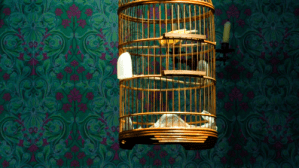 One of my favorite details is the wallpaper in her home with her family. It’s such an interesting color scheme to have in this time period (Spanish Flu, WW1 time frame). The colors and pattern is gothic-esque or Victorian gothic inspired. Purple and green are ⅔ of a triad color scheme that if you add orange, it completes. And because the colors are more in shades, they work really well together. The yellow bird in the cage is a complimentary color to purple and again, the composition and detail in the home really works. We’ve talked about how important set design is and this is a great example of that.
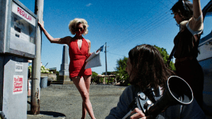
 And of course, we round out with MaxXxine(2024). There were A LOT of things happening in this movie but it felt too cushioned. I liked the idea of Maxine venturing away from her past and into more SAG film opportunities and also dealing with the confrontations of said past but I wish there was more character development in Leon (Moses Sumney) or Tabby (Halsey) which would have made their deaths more impactful as an audience member because we would care but all these extras were just there to be killed and it sucks. I also wondered if it was just a thrown out idea to have Maxine run through the Universal lot because it looks cool.
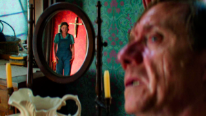
 Highlights from Maxxxine are using red lighting in those scenes of going to a peep show and the use of red which we’ve discussed many times represents passion and anger, which fits perfectly with this film’s emotional drive.
I think the film is quite glossy looking. Not polished but there’s an impossible-ness in the film, visually, that throws me off. When I think of X, I can see the inspiration there and how it looks. Like I said earlier above, there’s a gritty vibe there. I don’t get that same vibe like I do with X or Pearl which even though it takes place in a certain time period, I believe that time period we’re in. It’s very Wizard of Oz-esque, even down to the title card.
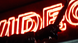

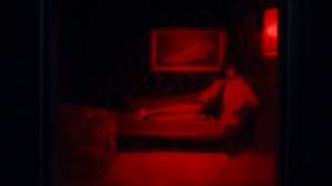
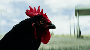
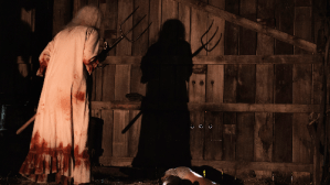
Throughout all three films, the color red is very important. The color is emotional. Brittany Snow’s character Bobby-Lynn in X wears the red romper, indicating she’s a sexual being, she’s in sex work to the random rooster being red and black, older Pearl in red lighting for feeling like she lacks her former sexual prowess and anger towards the younger group. We go to younger Pearl who has a red farm on the property, she wears the red period dress and it showcases the urges of sexuality and sexual wants and the anger and frustration of her parents. And Maxxxine is the peep show, the “video” neon logo in the video store which is occupied by someone who used to be in sex work.
 In conclusion, the films have a unity through color story and characters. Can I say that some worked better than others? Yes. But does it hinder all the films combined? No. I think X, Pearl and Maxxxine have great highs and overall, these are fun films to watch. I think Mia Goth gives her all in them, I particularly love her in Pearl because it seems more emotionally driven and again, Maxxxine just feels generic.
Which film is your favorite? What do you like about the X trilogy? What would you change? Leave a comment below and I will see you guys soon!
Peace, love and chicken grease.

Leave a comment