Who loves title cards??
This girl does!
I just think title cards in of itself are art because they can tell you anything and everything you’re about to see without giving much away. It can be paired with music or special effects or a certain mood and they have true staying power. You might not remember a film but you will remember the title card or the music associated with said film. From Wicked (2024) giving resemblance to The Wizard of Oz (1939), the red text and elated and serious mood to The Lion King (1994), it makes me cry every single time I heard The Circle of Life) or the familiar blue text of “a long time ago in a galaxy far, far away” and then being blasted by the sounds of John Williams as Star Wars (1977) comes onto the screen.
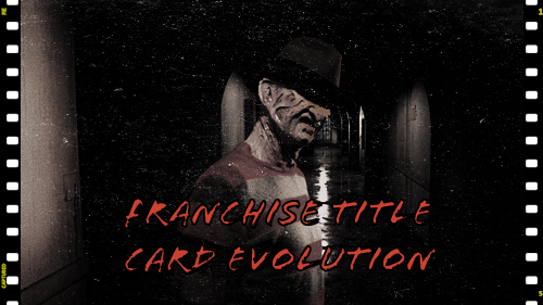
But this is a horror blog and we are focusing on more creative themes and we’re gonna take the concept of title cards and apply it to this genre and well, I wanted to focus on specifically franchises where title cards are repeated, changed ever so slightly and I picked my favorite franchise as an example of a franchise title card evolution.

I chose A Nightmare on Elm Street. Why? It is my favorite franchise (except that dreadful 2010 remake) but also it’s quite familiar to even the general audience. It’s been around since 1984 and we recognize that Freddy Krueger is probably one of the big icons of horror, especially 80s horror and even if you haven’t seen ANOES, you know who Freddy Krueger is. It remains identifiable which I find important when you are working within film franchises.
There are 8 films, maybe 9 if you include Freddy vs Jason (2003) and a tv series “Freddy’s Nightmares” (1988-1990) but I also think there’s a lot to be said about the title cards of this franchise. And the biggest reason why I chose ANOES as well is that there are more than 3 films to really see how the franchise through its times changed, stayed the same, or did something completely different.

Then later on, I’ll give out some honorable mentions of franchises with interesting title cards and even trilogies that deserve big shout outs. Let’s start with A Nightmare on Elm Street (1984). Simple colors of black background, red and white font colors, “childish”, texture is messy, grungy, blocky, rough around the edges, clearly handmade. Another word to use: full. Very simple but I enjoy how the title comes from the bottom of the screen with the music and then into the familiar score.
A Nightmare on Elm Street 2: Freddy’s Revenge (1985) – the first of having a “second” title card which I find interesting. We have jumped from a plain background to footage of the film which connects with the theme of bringing Freddy into the real world despite the rules being set in the previous film. “A Nightmare” has sharper edges, thin, a neon glow and white font. It is the opposite of the original first film (on purpose). The “second” title card is a large, capitalized font that is steel or metal, WHY? A reference to Freddy’s glove?


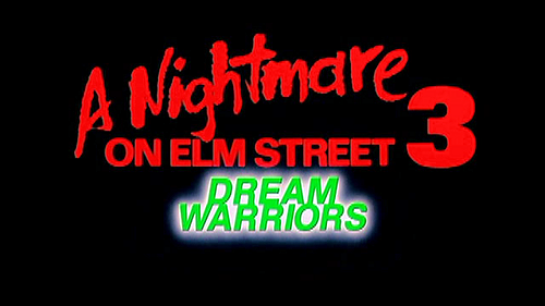
A Nightmare on Elm Street 3: Dream Warriors (1987) – Back to basics. The start of “a nightmare” logo that remains “consistent” until Freddy’s Dead. Back to black background, red font and the addition of green glowing text as “dream warriors”. Between 3-5, I call these the “MTV era” of ANOES, especially with Freddy being more in the forefront and quippy.
A Nightmare on Elm Street 4: The Dream Master (1988) – “a nightmare” still there from Dream Warriors, now we have “the dream master” in a smaller font with blue and again, highlighted or neon like the previous film of “dream warriors”. I also find it interesting that with this film and the next, we use the color blue and I wonder if that blue is a reflection of Alice.

A Nightmare on Elm Street 5: The Dream Child (1989) – We’re back to ANOES 2 with the separate title cards, even “a nightmare” resembles the second film which I didn’t notice we started doing this. “The Dream Child” is a child-like font, chalk which is a repeating theme within the films. It is accompanied by a chalk on chalkboard sound, again, adding more ambiance to the film that these are still children, legally. Also, it looks like someone wrote this with their non-dominant hand. It’s so irregular!


Freddy’s Dead: The Final Nightmare (1991) – completely different yet back to the typical color scheme of red, black and white. Blocky, capitalized letters for Freddy’s Dead and this one feels 90s. Like the previous ones give 80s with the neon and limited color choices but this one, very, very different. Almost like the first film. What is the smaller font? Times? Merriweather?

Wes Craven’s New Nightmare (1994) – We don’t even get a title card until the end credits and honestly, this film doesn’t warrant one because of the quality and the theme of the film. It’s the most simple of all the films when it comes to the title card. It’s just a black screen and white capitalized font and I wonder what the font is… it looks to be Cinzel? Could also be Times cos that was very popular.

The dreaded A Nightmare on Elm Street remake (2010) – The one thing I do like about this title card are the four slash marks but it also reminds me of tally marks. I just think this is a true product of its time but I do think it’s pretty dark. It feels and looks muddled. I appreciate the textures overlaid but still, we’re in the black and red color train that all the films established. Hell, even Freddy vs Jason is a red bloodied font.

So what did we learn from this franchise? There’s a consistency of being identifiable to the general public, using the same colors or typography which ranks it
Other franchises to look at that I would also look into would be: Halloween (each movie feels like its own separate movie with no connective tissue as title cards, not story wise), Scream (does great with consistency), The Evil Dead, Child’s Play, Hellraiser, Alien, VHS, The Texas Chainsaw Massacre, I would throw out trilogies that don’t use “an umbrella title” but they are connected such as the X trilogy (X, Pearl and Maxxxine), Gates of Hell (The City of the Living Dead, The Beyond, The House by the Cemetery), The Three Mothers (Suspiria, Inferno, The Mother of Tears) and even the recent Terrifier films have a sense of consistency with its typography and title screen.
So in conclusion, I think there’s something special about title cards within certain franchises, just shows the literal changes with the time period and some can be too much and over the top or mudded and other times, just be simple. You don’t need to do a lot to make the point across of what this film is about. I think horror, sci-fi, fantasy and some comedies have great title cards or they flourish more than something more serious. I think the creativity can be explored in those genres but I have been pleasantly surprised.
Coming up this month will have TWO extra posts because we’ll have 5 Wednesdays total and I didn’t want to take too long of a break in between so you guys will get a bonus post this month (as well as July, October and December).
Til then, peace, chicken grease and stay safe!

Leave a comment