Ahh, we all miss this man so much and his passing was just last month. That kind of creativity and rebellious energy will be missed from Hollywood and the overall climate of the scene. I am talking about the legendary man known as David Lynch and his passing is still fresh but I put him in the same category as like Wes Craven or Romero or Hooper where their talent and innovation in film is still so huge and impressionable that we still have inspiration from their works and how they were as filmmakers/writers, etc.
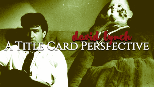
It’s such a huge gap to fill, if we want it to be filled or if it CAN be filled and in honor of him, I wanted to look at his filmography, specifically the title cards to his works because I am a believe in title cards telling you/us the audience of what we’re about to step into.
We are going to look at Eraserhead, Dune, Twin Peaks and its many varieties of work, Blue Velvet, etc and just talk about the use of typefaces, color theory, anything worth mentioning and it’s going to be fun and educational!
Let’s get into it.


 I thought about this topic a little after his passing but I also watched Michael Jackson’s Thriller on youtube in the background and it also served as inspiration. Thriller’s title card tells us exactly what we’re in for in that short time frame of the music video or short film as it’s also known as. It’s got the red use of color, there’s Michael’s heavy breathing in the background, the font choice looks like claymation which also gives off this threatening, horrific vibe. Especially with the typeface being sharpened and ALL CAPS it feels not safe. And using red, we know red red represents passion, anger, horror, blood, danger, etc. All of those things make that title card very iconic on its own and I wanted to see what can we tell about Lynch’s films (or tv series) that also shows us his inspiration and why certain things were chosen.
So what I did was I looked up most of his filmography, there are some films I hadn’t seen before like Lost Highway or Inland Empire but I had very interesting responses to said title cards and because most of his works falls under thriller and horror in some capacity, I am doing what I can easily find and also input on the ones that don’t fall under that umbrella.
But first, a big heads up from me: I went to school for a couple of years at an art institute (yeah, THOSE schools) and was majoring in Graphic Design before dropping out of the financial situations. The information and insight being shared is from my own experience, notes taken, actual printed facts from textbooks and teachers about typography, font choices, color, etc.
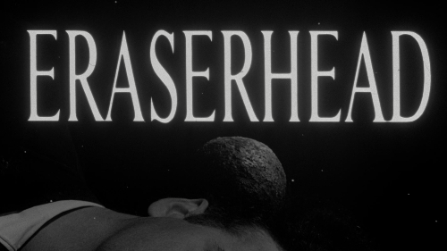
The first one that I wrote down is 1977’s Eraserhead.
 Eraserhead (1977) – Rene Margritte? I have seen this film a couple of times and looking at the screencaps for the movie made me think of the artist Rene Margritte. His work is surrealistic, conceptual, very odd, exaggerations of the human form, which fits in with this movie visually. The font is so simple for a film that is NOT.
The Elephant Man (1980) – Simplistic font choice, ease, reminds me of bones? Maybe I have bones on the brain because the Merrick bones at one time wanted to be bought by Michael Jackson. YOU ARE BACK IN THIS BLOG AGAIN, MJ. He didn’t get them but I find the typography choice to almost look like a silent film’s title card or inter-titles.
Dune (1984) – Greek, Roman mythology… Clash of the Titans (1981), royalty, there’s an episode of Spongebob with this similar font and I’m so sorry David Lynch. Again, the color scheme of brown, brass, earthy tones is very appropriate to history being written on the sands of Aarrakis. I think this title card brings up more childhood memories for me.
 Blue Velvet (1986) – Seduction, intimate, soft, “out of the blue” aka unexpected, emotional, the chosen script is “snell roundhand” which was created in 1966 by Matthew Carter. There’s a feminine element to the script which is important for the film with the character Dorothy (played by Isabella Rossellini) and her blue eyeshadow and blue velvet dress. It almost seems “fancy” or “fantastical” or ornate.
Wild at Heart (1990) – Is that the same font for Twin Peaks? A fire background is passionate, romance, heightened, and destruction which with a title of Wild at Heart, there are ups and downs and peaks of emotions. That’s what this title card feels like, it feels like a relationship on screen. This is the first in a line of a title card using scripts in CAPS.
Twin Peaks (1990-1991) – The green outline always stands out to me. And now looking at it closely, the brown font color underneath would have blended in so perhaps that is why we are using green. Green also represents generosity, hope, luck, greed, money, envy, inexperience, all of these things are topics within Twin Peaks and similar to Blue Velvet, color choice makes a huge impression.
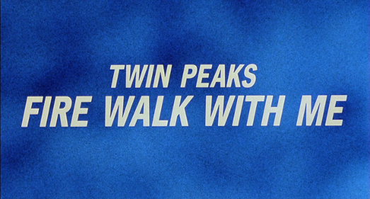
Twin Peaks: Fire Walk with Me (1992) – Maybe Lynch loves this font choice, again, another choice of blue background which gives me the feeling that with small towns in David Lynch’s world, there is “blue”. It’s a similar script to Wild at Heart which I find fascinating and I also know that there’s the cover to Fire Walk with Me and it’s got flames around the heart shape pendant with Sheryl Lee (as Laura Palmer) so now I’m seeing similar ideas from Lynch and his collaborators.
 Lost Highway (1997) – A bit on the nose with this title card. The font also gives me “street” video game-esque? I think of that game Pole Position and maybe it’s not on purpose, but I find that matching the font to the title of the film is interesting. It’s not all the way Highway Gothic typeface (it’s what we use in the US for interstates/highway signs) but it is shorty, stockier and yellow. Yellow is a color of happiness, creativity and a big negative meaning is caution. It’s the color of signs to go slow, tape around an investigation, bumblebees, the 80s Batman logo, when we drive it’s the “yield” or slow down traffic light. Black as its background, also when combined with yellow, reflects these same “negative” notions like caution and danger. This is a really cool example of color theory. AND, and reflects traffic lines aka we can “pass”.
Mulholland Drive (2001) – It is a literal street sign. Not the accurate street sign but it’s darker and the script is in CAPS again and it resembles the Hollywood sign. I know that font could be sans serif but just blockier but that’s just a guess. There’s nothing too special about this one. The font does match the location and aesthetic of California and the plot.
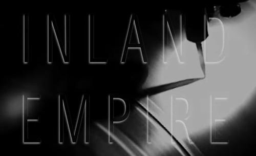
 Inland Empire (2006) – Why am I getting Art Deco? Is it the font choice and shadow? Metropolis (1927) and painter Tamara de Lempicka images in my head reflect this. I haven’t seen this film before, I did look up the synopsis and it does sound interesting. Maybe it’s the lighting and shadows around the script but like I mentioned above, the visuals of other pieces of art were flashing in my head to the point where I confused Lempicka for Artemisia Gentileschi and those are two totally different painters. But the title card is swimming with art deco vibes.
There are a couple of films I skipped, some television shows and there’s a lot of music videos that Lynch had done but I wanted to focus on the films as well as Twin Peaks because they are such huge parts of his life and in conclusion, he is someone who has his hands in everything he creates. I see him as a true creative person, a visionary, and if he can’t do something, he feels like a person who would collaborate with the best to achieve what he “sees” and I can’t say that about a lot of people. Creativity is a gift and when used correctly, it becomes bigger and there’s a handful of those in the film industry I can attach that idea to and Lynch is one of them.
But what do you think? How important do you think the art of title cards is? Eventually I will do a larger post on that concept but til then, leave a comment below or like the post and share! I’ll be back next month with two posts every other week.
MAJOR TIP: Key things to remember when you are working with typography is making your script eligible, picking the right script for the right impact and as important color is, simply doing black and white first is always best. The biggest crime you can achieve is when you use bold, italicized, underline, caps in one. DO NOT DO THAT!

Leave a comment