
OHHHHHHH BOY!
GUESS WHO’S BACK? BACK AGAIN? THE BLOG IS BACK, TELL SOME FRIENDS!
It has been six months give or take since I decided to end the blog and/or take a long needed break. And in that time period, I’ve had time to reflect, work on self, focus on health, all the things that I am still going to do but I really missssssed this blog. I don’t miss working myself to burnout so we’re gonna do things differently here!
More on that later!
Since this is the first blog back since closing up shop in June 2024, I feel as though I lost a bit of my focus and identity with this blog. So many things, topics, ideas, running around like a chicken with my head cut off but at the core of what I love about this blog and horror (and filmmaking) is the art of it. And that is the re-focus of Shots of Horror 3.0. We’re gonna talk about things under the umbrella of “art” such as cinematography, typography, education, art direction, insight and less reviews and gimmicky of that sort where you can get that somewhere else either on a blog or Instagram or youtube channels, etc.
And me who has been running this blog since 2015 (tumblr and wordpress) and a longtime, childhood fan of horror and majored in fine arts, museum studies and graphic design knowledge, we’re rebranding and sticking to certain themes. And today’s theme is my favorite subject matter: COLOR THEORY.
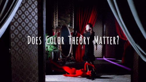
But… Does Color Theory Matter in Horror? The answer is simply YES. But why? How? Let’s talk about that.
Now, for this first post, I will be using a film as my example. And that example is…
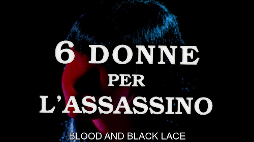
Title: Blood and Black Lace
Year: 1964
Director: Mario Bava
Costume Design: Tina Grani
Director of Photography: Ubaldo Terzano
Now why this film? I think this film does a great job of incorporating lighting, filters and color and using those to incorporate and be a part of the story versus “something cool” or an afterthought. A huge inspiration is Bava’s insight into a Swedish film from 1954, “Mannequin in Red”, however, that is still proven to be a rumor since there was no possible way for him to have seen this film. Nonetheless, Mannequin in Red also takes place within a fashion house “La Femme” which Blood and Black Lace also centers around in this giallo.
Which brings us back to the core question: does color theory matter in horror? What is it about Blood and Black Lace that brings us to a lesson of using color theory to bring your film to life?
But let’s answer a question first. What exactly is color theory?
COLOR THEORY is a very powerful tool. It is the study of how colors relate to each other, how they can work against each other, and nonverbal communication. COLOR is an element which has three properties: HUE, INTENSITY, and VALUE. HUE is the name of said color, INTENSITY is the purity or strength of the color such as brightness or dullness and VALUE is the lightness or darkness of said color. A great example of these three elements are those personal color analysis videos on youtube where the person gets to see what colors work best for their skin tone, hair color, etc. There is a reason why certain colors look great, brightens their skin and why other colors can wash them out. It comes down to color theory.

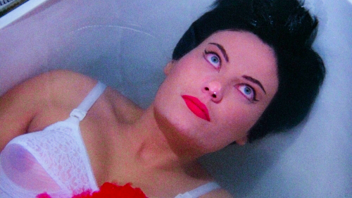
And with giallo in general, color theory is all over the damn place. For example, blood tends to be very, very red, like unnatural red. It’s so bright and blown out. Look at Dario Argento’s Suspiria (1977) and notice how red the blood is shown. The same can be said here in Blood and Black Lace. The color is stimulating, overwhelming and powerful. When you see the color “red”, it is alerting us to danger. Something’s wrong, what’s wrong? And red represents so many things such as anger, passion, love, violence, danger (so does the combination of yellow and black) so when we see red show up in this film, it represents a mixture of all these emotions, especially in the context of the film and its leather gloved killer.
Other colors that the film uses well: purple, pink, green.
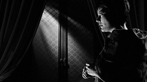
But then I got curious. What happens when we take the color out of a film that showcases great detail for color and lighting. Let’s see what happens when you take this film and turn it black and white? Like we have established before, red is a very powerful and vibrant color. Even when we turn the photos into black & white (or grayscale), it’s almost as if the entire film’s impact changed. There’s a sense that details have been lost. Which is why lighting is important and color correcting but looking at the handful of screencaps we’ve changed, it almost starts to look like a different movie where the plot has nothing to do with a fashion house.
 And I honestly think that color and the use of color was heavily incorporated into this film that when you snatch it away, it just looks off. And I wonder what the entire film would look like, feel like, in its entirety. Would the film still have this same sense of fear and sinister elements or become a completely different film? Is there a black and white version made of this like… how the The Mist (2007) has two different visual options? If not, someone should do that on a dvd/blu ray special edition.
And eventually, I’m going to talk about what happens when color (theory) isn’t important when you make a film in black & white (can you guess what it is?) But what do you see differently? What other films in horror use color well or become its own character? Leave a comment below and I’ll see you guys soon!
{*Filmgrab, Google Images for Blood and Black Lace screencaps
*Polarr App for image editing}
